Regression Error Characteristics Curve
Introduction
In machine learning, a Receiver Operating Characteristic (ROC) curve visualizes the performance of a classifier applied on a binary class problem across all possible trade-offs between the false positive rates and the true positive rates. A graph consists of multiple ROC curves of different models characterizes the performance of the models on a binary problem and makes the comparison process of the models easier by visualization. Additionally, the area under the ROC curve (AUC) represents the expected performance of the classification model as a single scalar value.
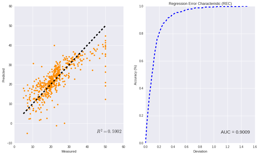
Although ROC curves are limited to classification problems, Regression Error Characteristic (REC) curves can be used to visualize the performance of the regressor models. REC illustrates the absolute deviation tolerance versus the fraction of the exemplars predicted correctly within the tolerance interval. The resulting curve estimates the cumulative distribution function of the error. The area over the REC curve (AOC), which can be calculated via the area under the REC curve (AOC = 1 - AUC) is a biased estimate of the expected error.
Furthermore, the coefficient of determination $R^2$ can be also calculated with respect to the AOC. Likewise the ROC curve, the shape of the REC curve can also be used as a guidance for the users to reveal additional information about the data modeling. The REC curve was implemented in Python.
# Loading Packages
import numpy as np
import matplotlib.pyplot as plt
import seaborn as sns
from sklearn.model_selection import cross_val_predict
from sklearn.metrics import r2_score
from sklearn import linear_model
from sklearn import datasets
from scipy.integrate import simps
# Loading a sample regression dataset
boston = datasets.load_boston()
X = boston.data
y_true = boston.target
# Defining a simple linear regression model
LR = linear_model.LinearRegression()

# predicting using 10-folds cross-validation
y_pred = cross_val_predict(LR, X, y_true, cv=10)
# Function for Regression Error Characteritic Curve

def REC(y_true , y_pred):

    # initilizing the lists
    Accuracy = []

    # initializing the values for Epsilon
    Begin_Range = 0
    End_Range = 1.5
    Interval_Size = 0.01

    # List of epsilons
    Epsilon = np.arange(Begin_Range , End_Range , Interval_Size)

    # Main Loops
    for i in range(len(Epsilon)):
        count = 0.0
        for j in range(len(y_true)):
            if np.linalg.norm(y_true[j] - y_pred[j]) / np.sqrt( np.linalg.norm(y_true[j]) **2 + np.linalg.norm(y_pred[j])**2 ) < Epsilon[i]:
                count = count + 1

        Accuracy.append(count/len(y_true))

    # Calculating Area Under Curve using Simpson's rule
    AUC = simps(Accuracy , Epsilon ) / End_Range

    # returning epsilon , accuracy , area under curve
    return Epsilon , Accuracy , AUC
# finding the deviation and accuracy, and area under curve for plotting
Deviation , Accuracy, AUC = REC(y_true , y_pred)
# Calculating R^2 of the true and predicted values
RR = r2_score(y_true , y_pred)
# Plotting
plt.figure(figsize=(14 , 8))

plt.subplot(1, 2, 1)
plt.scatter(y_true, y_pred,color = "darkorange")
plt.xlabel("Measured")
plt.ylabel("Predicted")
plt.plot([y_true.min(), y_true.max()], [y_true.min(), y_true.max()], 'k--', lw=4)
plt.text(45, -5, r"$R^2 = %0.4f$" %RR , fontsize=15)


plt.subplot(1, 2, 2)
plt.title("Regression Error Characteristic (REC)")
plt.plot(Deviation, Accuracy, "--b",lw =3)
plt.xlabel("Deviation")
plt.ylabel("Accuracy (%)")
plt.text(1.1, 0.07, "AUC = %0.4f" %AUC , fontsize=15)


plt.show()